How to make a blog banner in Photoshop Elements
Update: 2023-PSE 5.0 is obsolete now, but these same steps will still work if you have a later version of PSE. I have upgraded to PSE 15.0 and though things are placed slightly differently, everything in this tutorial still applies.
I’ve had a few requests for help on this, so here you go. I don’t know how to do it in any other program, so if you don’t have Photoshop Elements (PSE), I apologize. This should be fairly similar for most versions of PSE, (I have 5.0) and maybe even kind of in full Photoshop. I haven’t the faintest idea about that. If you don’t have PSE, you can get a free 30-day trial download at the Adobe website.
You can make a pretty simple header, or an extremely complicated one (which I really can’t), but I’m going to show you how to do one that’s somewhere in between. My best advice is to just play around with things. If you don’t know what something does, just try it out. You can always click undo if you hate it.
With that, let’s get started.
1. First things first. Get yourself a new, blank canvas. You can do this by going up to file and choosing New >Blank file.
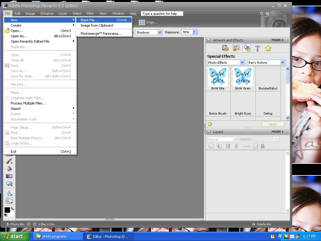
2. A dialog box will come up asking for specifications. I usually size my headers to be approximately 900 pixels wide and 300 pixels tall, at 72 dpi.
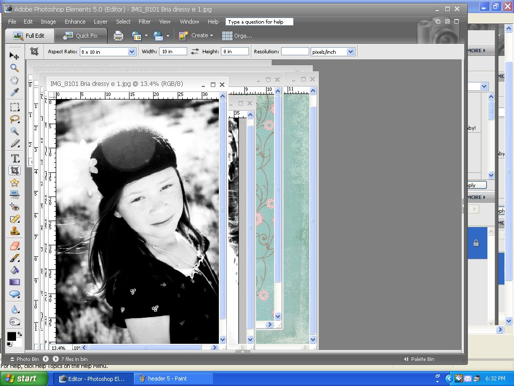
 3. Next, you’re going to need to open some stuff to make your header pretty. I always use digital scrapbook paper and elements, as well as pictures. If you don’t have any digital paper, there are loads of freebies on the internet. Just Google it. twopeasinabucket.com has a free digital kit each month, which is where I generally go to get mine. The three papers I (randomly) decided on, are designed by Jessica Sprague for 2Peas.
 4. Once you have everything open in PSE, go up to Window>Images>Cascade.
(You can also choose the tile option instead of cascade—the images will show up in a grid instead of cascaded as is shown in the next slide.)
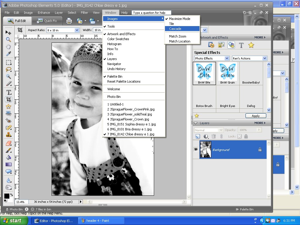 5. Once you do that, your screen should look like this:
 6. You can bring any element to the front by clicking on its title bar, and you can also click and drag them around if you need to. So, arrange the windows in a way that allows you to have both the blank file and the paper you want for your background at the front.
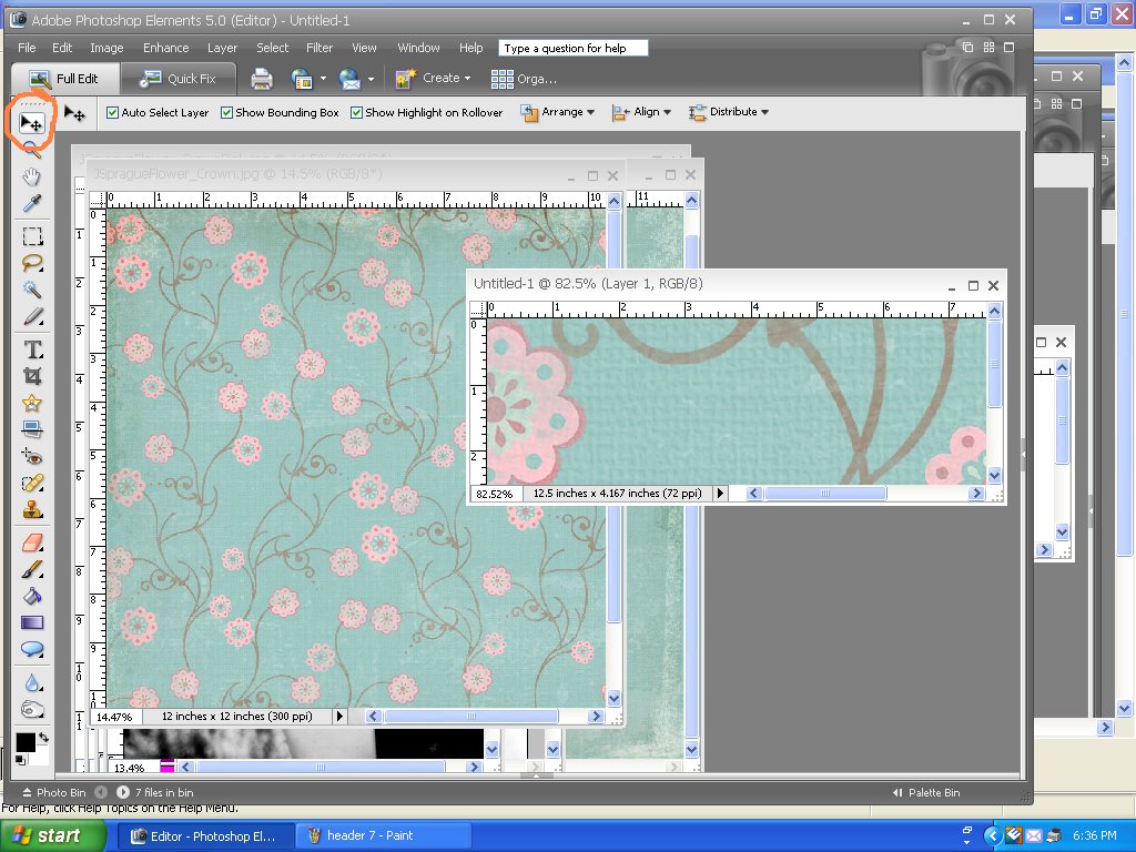
 7. Pick your move tool, either by pressing V on the keyboard, or choosing the tool that looks like an arrow and a plus-sign on the top of the tool bar (found along the left-hand side). Now, click on your background paper and drag it over to your blank file.
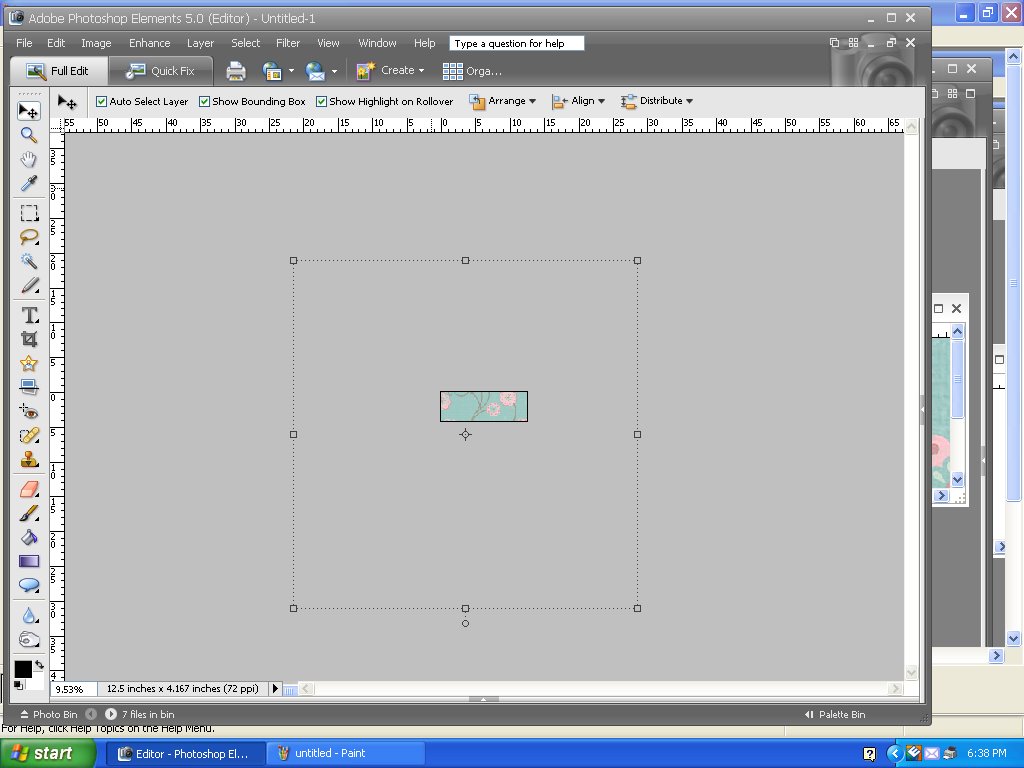
 8. The paper will almost always be a lot bigger than the blank file. If you like how it looks all big. Great. Leave it alone. If you would like it to be smaller, first click on the maximize button on your now not-so-blank header file. Zoom out (you can do this easily if you have a mouse with a scroll. Otherwise choose the zoom tool by pressing Z on your keyboard, or the magnifying glass looking tool), until you can see the outline of the digital paper.
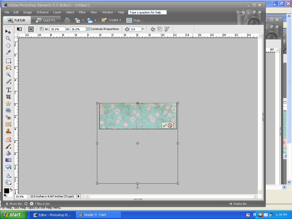
 9. Next, just click and drag the corners of the paper and resize until you’re happy with what your background looks like. If you like it, click the green checkmark.
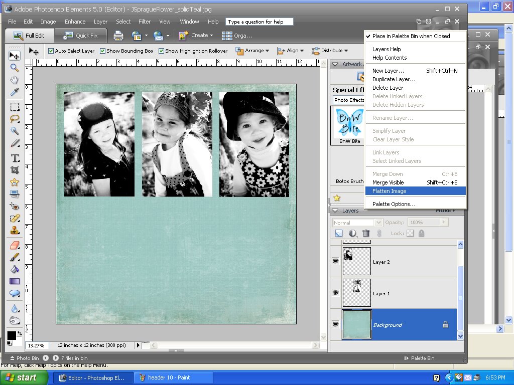
 10. Now, let me interject that I totally make my headers up as I go along. I rarely have any idea what they’re going to look like. Sometimes they turn out wonderful, and sometimes I hate them. It’s just how the process goes with me. So, for this one, I decided I wanted to the pictures to have a different background than the flowers, so I first dragged them onto the blue paper and arranged them there. In order to do this, I repeated steps 4 through 9. You could just put them straight onto the header if you wanted to. Once my pictures were arranged how I wanted them, I needed to flatten the image. You can do this by clicking More>Flatten Image on the layers pallette.
 11. Then, I needed to crop it down, so it was a rectangle instead of a square. You can do this by choosing the Crop tool, either by pushing C on the keyboard or the little picture frame looking thing on the tool bar (describing the tool pictures is hard). Choolse no restriction up on the tool bar, and crop away to your heart’s delight. Once you like the crop, click on the green checkmark and you’re good to go.
 12. Once that was done, I repeated steps 4-11 and moved the pictures onto the pink paper. Then I repeated steps 4-9 and moved the whole thing over to the actual banner.
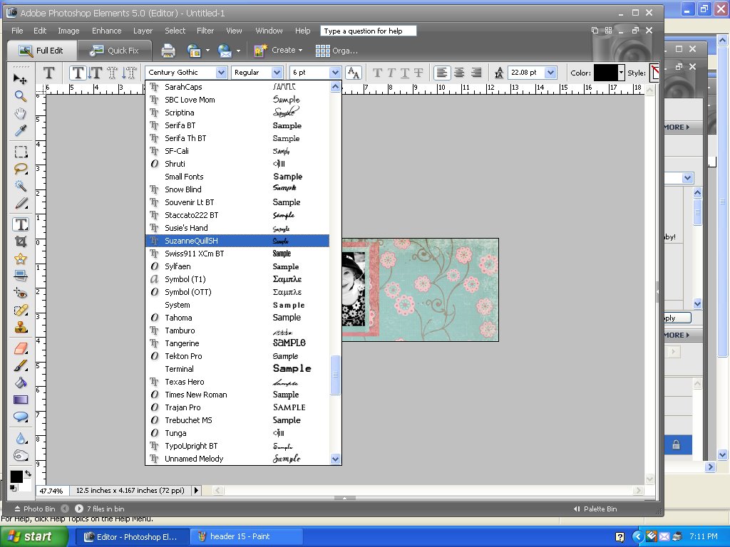
 13. Now it’s time to write your title. Choose the type tool, either by pressing T on your keyboard, or clicking on the big T tool on the tool bar. Now it will act kind of like a word processor, so you shouldn’t find this part too difficult. First, choose a font, and then a font size. Then click onto your banner around where you’d like the text to show up and start typing. It will type in the color shown at the top right of your screen. Just click in that box if you’d like to change it. Just like in Word, you can highlight your word one you’ve typed it and change the color, font or point size until you’re happy.
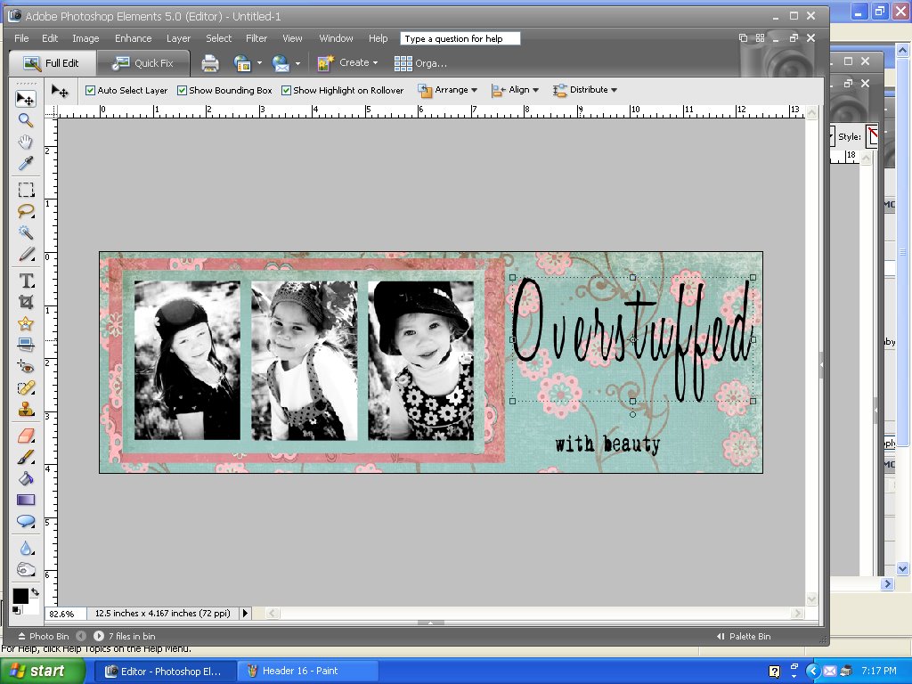
 14. There’s one thing that doesn’t act like a word processor. Once you’ve typed, you can move the text around. There are two ways to do this, but I’ll just show you the easier of the two. After you’ve typed your text, pick the move tool again. (V on the keyboard, plus/arrow on top of toolbar.) Click onto your word, and a box will appear around it, allowing you to move it around.
 15. Once I had my text where I wanted it, I could have been done, but I decided that it needed a little something else. So, I went to my brush menu and found a brush that I thought might look good. You can get to the brushes by presing B on the keyboard or clicking on the paintbrush on the toobar. You can also download lots of free brushes for PSE (just Google it), but for the purposes of this tutorial, I decided to stick with whatever was already there. In the Special Effect brushes I found a butterfly. The thing about Special Effect brushes is that you have no real control over where they go….they kind of just go willy-nilly around the general area you click on. So, I just clicked away with the butterflies until I sort of liked what I saw.
  16. And then it was finished! Not sure if I’ll ever use this one for my blog…if I do, I’ll probably have to wait till spring.

17. Now, to get it on your blog. The easiest way is to choose the header gadget and upload your header. Just make sure that you click instead of title and description and shrink to fit. Blogger is a lot smarter than I am about what fits best on the screen.


Too bad I don’t have photo shop. I always enjoy your headers.
I am getting Photoshop. I really want to do those headers.
Thanks for the tutorial. When I get it and get it going, I will invite you to have a look.
Right now, check out the pictures of our snowfall here in Southeast Texas. It’s a rarity.
Hey, thanks! I am excited to try this out!
I’m such a techno-idiot I don’t even know if I have something akin to PhotoShop. (Probably not, eh?)
Thanks for the tutorial!
cool tutorial. too bad I don’t have photoshop. (But kinda been wanting to get it, so, maybe I’ll be referencing this in the future!)
This is great Thanks!!!
This is like Chinese to me! I don’t have Photoshop either.
I LOVE that paper you are using for the background.
It took me so long to get my header onto my blog (hours and hours, with a bit of crying) that I was thinking I would never change it again. I don’t have Photoshop, but I might be willing to give this a try if/when I get Photoshop. I will be bookmarking this page – thanks!
I have that and another program and wish I knew PSE better b/c the other program ( picture it ) is so dang easy LOL
your headers always look amazing
Thanks for sharing this. I don’t have Photoshop yet but am waiting till I get a faster computer… everything freezes up on mine and takes so long that it makes me want to scream. But I can’t wait till I can get it and start using it!
You make this look so easy!☺ I gotta try it! Thanks!
I am looking foward to trying this. I’m also regretting spending the money buying my Christmas one!
Wow, good tip..
|Free Download Games And Software|Pasang Iklan Gratis|
I am glad I found this, I have been wanting to try and make one and I have PSE 5.0!!!
Thanks!
Wow!! FINALLY a tutorial I could follow!! Thanks a lot! This was great! I MADE MY FIRST HEADER!!!
What about creating your own blog background using Photoshop Elements??? Any help would be greatly appreciated!!! I have lots of digital scrapbook paper downloaded, and think this would look nice as a background! I’m kinda new at this whole digital scrapbook world! Please direct me in the right direction 🙂
thanks so much for the step-by-step instructions… very helpful!
Thank you so much for this post; very helpful and easy to follow. I just updated my blog and I love it and it's nice to know that it's easy to change when I'm ready to try something new.
I am just trying to make a header and found your blog which has been really helpful. I have a MAC and am unsure how to shrink my picture to fit into the header. Can you help?
Hi,
I love your tutorial!…and your blog! Tehe tutorial looks really easy to follow, best I've found yet…however I'm stuck at the "getting free digital scrapbook paper" Somehow I don't get it 🙁 Could you direct me as to how to get it at 2peasinabucket? …when I put in free digi kits and click on the kits they want to charge me for them. I'm trying to make a new banner for my blog. I just purchased Photoshop Elements 8 and don't know ANYTHING about how works yet. Thanks so much!
Blessings,
Debbie
debbiesaenz.typepad.com
I really like your site. Excellent content. Please continue posting such profound cotent.
I happened on your blog and I'm so thankful! Thanks for walking me through how to make a header. I've had Elements forever and I'm always bugging my friends to make headers for me because I'm clueless! haha!
Great post, Thanks for nice post.
Thank you, thank you, thank you for this great post!!
I like to on my family and my own photos.Thanks for sharing it here.
This comment has been removed by the author.
Nice post… Thanks you
Thank you SO much for this! I used it and now have a cute custom made blog header 🙂 I wish I could learn more from you…I have PSE and need so much help! I took me HOURS to do this! My blog is: madcatmartin.blogspot.com if you want to see what you helped me do!
Thanks again!
Thank you! I had no clue on how to make mine and you just made it easy! I just posted a link of this page on twitter!
What a wonderful blog! Thanks for taking the time to teach this tutorial. Well done!!
smiles,
jo'ee
joeeinkdesignstudio.blogspot.com